It’s no secret that a user-friendly, responsive and pleasing website is crucial for businesses today. Websites tend to be one of the first interactions customers have with brands. And a well-designed website will undoubtedly help with its search engine ranking.
Websites are the face of a brand, and so they should represent its visual traits with all the elements like logo, icons, colors, and pictures. Great websites also have some crucial text: brand attributes, services or products philosophy, and maybe what makes it unique.
Websites are also the best way to strengthen a brand, connect with its target audience and create remembrance. When businesses delay their website’s updatesor redesign, they also underestimate its power.
There are many reasons to redesign a website, including updating its looks, improving performance, changing brand image, or simply refreshing the view. Below are some of the best website redesign exampleswith before and after photos. Be inspired.
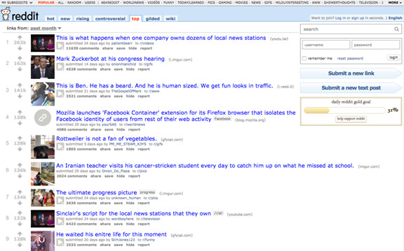
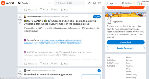
1. Reddit
Before:
Reddit has always been straightforward: part of their identity is the self-made communities. So their redesign couldn’t change colors or the general aesthetic. Instead, they made it easier to navigate with an interface very similar to Facebook’s. There is a panel on the right side to choose top communities and a centered menu to search posts according to interests.
After:
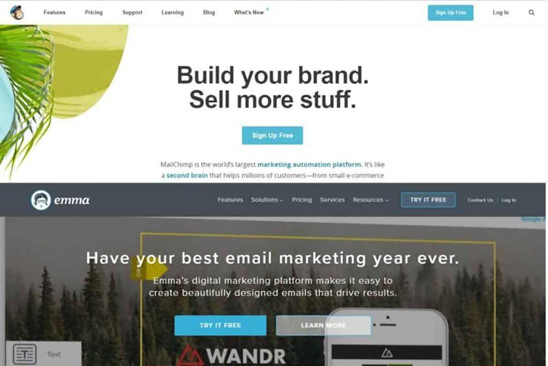
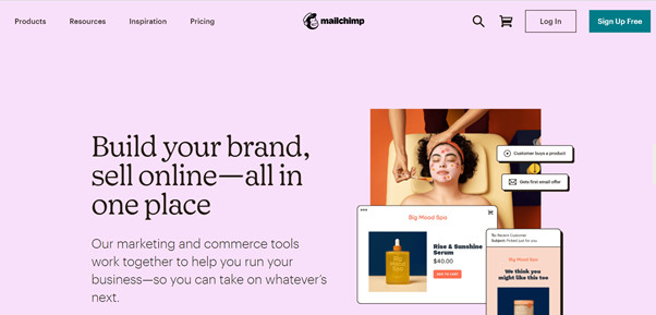
2. Mailchimp
Before:
The previous website had great functionality, but the company wanted to make a different statement to highlight a key value to its more extensive customer base. The older version was clean and easy to navigate. But the redesign has more vivid imagery and a brighter color palette, which stands out amongst workplace aesthetics.
After:
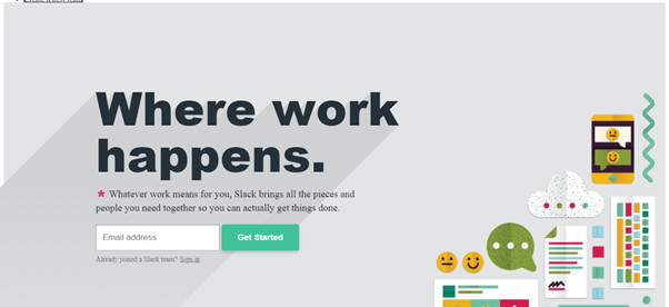
3. Slack
Before:
The previous website had great functionality, but the company wanted to make a different statement to highlight a key value to its more extensive customer base. The older version was clean and easy to navigate. But the redesign has more vivid imagery and a brighter color palette, which stands out amongst workplace aesthetics.
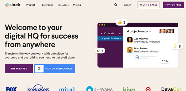
After:
3. Slack
Before:
The previous website had great functionality, but the company wanted to make a different statement to highlight a key value to its more extensive customer base. The older version was clean and easy to navigate. But the redesign has more vivid imagery and a brighter color palette, which stands out amongst workplace aesthetics.
After:
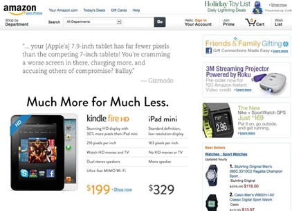
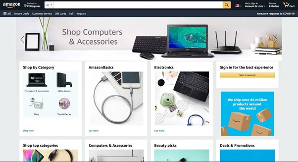
4. Amazon
Before:
Even giant companies like Amazon delayed a bit its website redesign: in 2012, their website looked outdated. It had too much text on the same page, which made it pretty challenging to navigate. Besides, it lacked some color and imagery.
The new design includes clear category boxes with alluring pictures, a clean banner, and customized recommendations. The primary colors within the brand now include its navy blue and yellow.
After:
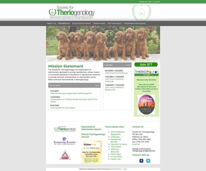
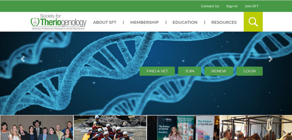
5. Society for Theriogenology
Before:
Small businesses and organizations also redesign their websites to make a better and longing impact on their visitors. This is a great example: This organization launched a massive redesign with drastic changes. They had a pretty old website, unresponsive and unappealing.
The redesigned version included a new hero image on the home page, a main menu on the top shelf, and an attractive image gallery when scrolling down, along with relevant news about the organization.
After:
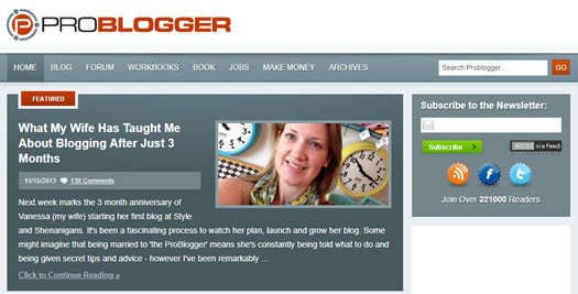
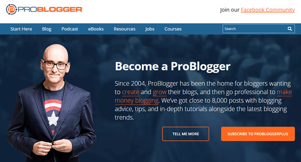
6. Problogger
Before:
Small businesses and organizations also redesign their websites to make a better and longing impact on their visitors. This is a great example: This organization launched a massive redesign with drastic changes. They had a pretty old website, unresponsive and unappealing.
The redesigned version included a new hero image on the home page, a main menu on the top shelf, and an attractive image gallery when scrolling down, along with relevant news about the organization.
After:
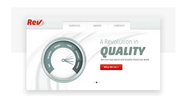
7. REV
Before:
Small businesses and organizations also redesign their websites to make a better and longing impact on their visitors. This is a great example: This organization launched a massive redesign with drastic changes. They had a pretty old website, unresponsive and unappealing.
The redesigned version included a new hero image on the home page, a main menu on the top shelf, and an attractive image gallery when scrolling down, along with relevant news about the organization.
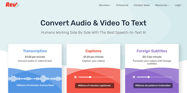
After:
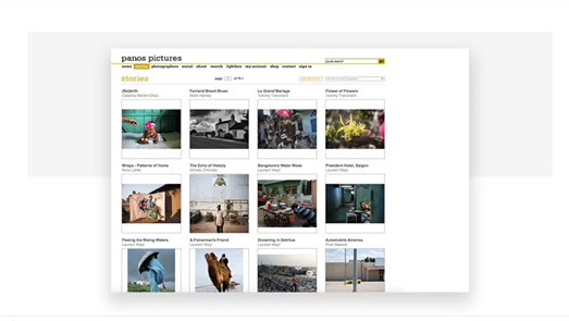
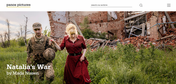
8. Panos pictures
Before:
The previous version was non-responsive and not mobile-friendly, not to say it had limited navigation options. The homepage was merely a navigation menu, a search box at the top, and images linked to photo stores.
The redesigned version includes similar elements, emphasizing a photo gallery: Panos is a photo agency, after all. But now, the website is fully responsive. The top navigation menu is now hidden in a hamburger menu, which deploys itself when clicked.
After:
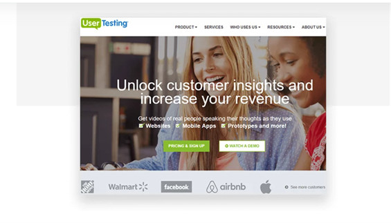
9. UserTest
Before:
The old version of this website had two significant issues. The first one was a needy organization. The homepage was primarily a three-slide carousel with two call to action buttons: sign-up, fees, and a demo. But the other two slides didn’t have a clear intention and were not correctly explained. The second one was that it looked very messy. The arrangement was not optimal for visitors, who perhaps felt lost when navigating.
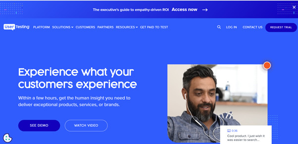
The new design improved its text count by 25%, making it lighter to explore and read. They added a new top navigation bar; the carousel is replaced by a bold value proposition next to photos and videos that explains their services and a call to action.
After:
All these examples have some similar traits. For example, they tend to simplify their designs and arrangements. We all know minimalism is a huge trend these times, but beware of getting too far away from your brand’s identity in search of this fashion. It is best to be simple but not too plain.
Also, mobile-friendly sites are mandatory, and maybe some extras like chatbots to help users navigate the site. And, if you have to choose between aesthetics and functionality, always prefer a well-functioning and responsive website.