No matter what your business is, your website is an undisputed requirement for overall growth in 2021. It’s not just about being online; you must create a website that’s memorable, graceful, easy to navigate, and fit for your user’s needs.
An excellent website for business, small or big, is a true reflection of your brand’s values. You only have a few seconds to convince the user this is the place they are looking. That’s why it’s so crucial that your website shows its message and purpose loud and clear.
Even if this sounds like an impossible task, today’s tech allows us to create websites for our businesses with little to no programming experience and at relatively low costs. Some multiple tools or builders offer demos or predetermined formats to develop your website and thrive online.
Some of these tools are:
Squarespace
Wix
WordPress
Weebly
Ucraft
A quick search on Google may show you thousands of guides and tips on creating a good website for your small business. But be sure to include creativity as the main ingredient in this task.
Nevertheless, if you want somewhere to start, check these seven quick tips to create your small business website:
Make sure to choose the right domain name: it must be short, without numbers or symbols, and easy to memorize.
Hire a website hosting that’s safe, scalable, and has good tech support.
Always include a clear and striking description of your business on your website.
Set up a quality CMS (content management system), software or app used to create and manage digital content. Some of the most popular CMS are WordPress, Drupal, Squarespace, Joomla, and Wix.
Choose a trustworthy e-commerce platform: if you’re thinking about selling goods or services on your website, you need an excellent tech to do it. Some of the best services to integrate online commerce are WooComerce, Shopify, Business Squarespace, Wix, and GoDaddy.
Build an interface that’s interesting, memorable, and easy to interact with.
Create and publish quality content periodically: you must post articles and blog content on your site every once in a while.
We highly recommend checking out other similar business websites: this may inspire you and give you some ideas of what works for the audience you’re trying to attract.
Here are some of the best small business websites. We cover everything from restaurants to dental practices.
Strategy #2: Be very specific about what you’re offering. You cannot take for granted that users already know your business or what you do precisely. A good practice is writing a list of services that includes everything your company can do.
Strategy #3: Always make contact between your business and customers as easy as possible. It may seem obvious, but many websites fail in helping users find contact info or communication tools like chatbots or email widgets.
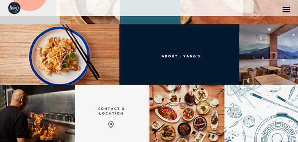
Yang’s Place is a family-owned Chinese restaurant in Australia. Their website stands out at first sight because of the geometrical front page, full of color, some text, and beautiful food pictures.
This website delivers a great job at telling users who they are and what they do. There’s an “About Us” tab in which we find graphics and short text chunks describing the restaurant. This format makes it very easy to read this information.
This restaurant is a crossover between Berlin’s street food and New York food style. The website is a single-page site, which can be very time-saving as all the information is available if you scroll down a little bit. It’s a straightforward yet effective strategy for websites.
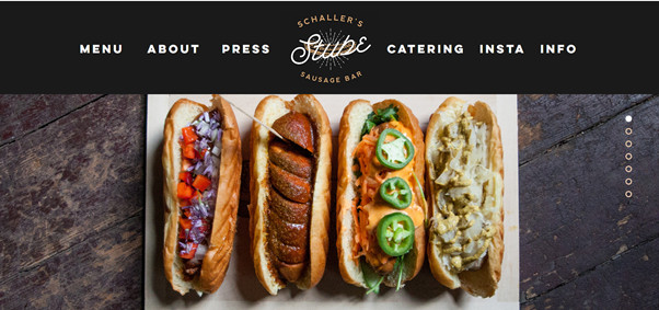
Schaller’s Stube chose to include many colorful pictures, history, news articles, Google Maps location, address and, contact data. All of these are the basics for restaurant websites.
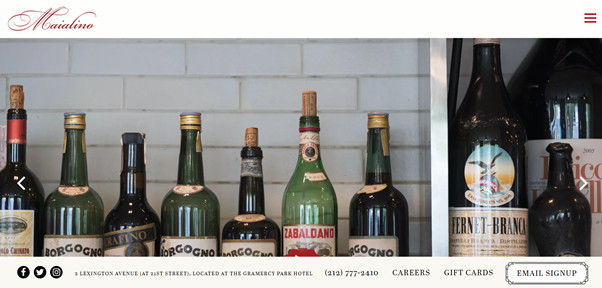
This restaurant’s website is all about the pictures. The front page is composed of a horizontal gallery with colorful, cozy, and tempting photographs. But the essential trait of this choice is that this gallery can reflect the brand’s identity: classic but relaxed.
There’s a very creative detail on this site: they included an anchored menu on the bottom in which we can fin de restaurant’s location, telephone number, and tab to buy gift cards.
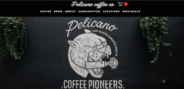
Pelicano is a coffee shop brand that also has a coffee subscription business on its website. Each type of coffee has its personality: a graphic character that identifies it and that has to do with the product’s traits.
We give this site 10 points in communication. Each product has clear labels that let you know if it is out of stock, or if it’s a new launch or if it’s a barista’s favorite. All of this makes it very easy to choose your purchase.
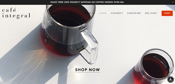
Café Integral sells coffee online and subscription plans. Its website shows all the variety of coffee and subscription fees very clearly and with simplicity. They chose a very appealing front page, but it doesn’t hog your sight. It invites you to navigate through the main menu or scroll down to look at some excellent coffee plantation photos.
This site doesn’t have an exceptional design, but it is actually charming, and it works fast and intuitively. On the bottom section, we find a little detail that users may ignore: instead of using “Locations” for their shops’ addresses, they wrote, “Drink.”
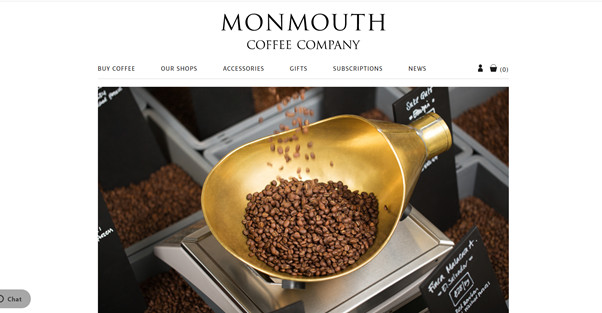
In plain sight, this website may seem too simple, but it has multiple virtues.
For instance, the front page picture: coffee lovers know that coffee grains are the most important thing for a good cup. This photograph is a magnificent sample of the experience and expertise this brand has around coffee.
Overall, this website’s design is elegant and not pretentious. The font is genuinely gorgeous, and pictures don’t overdo it. Also, it has excellent information about the coffee origins, and it’s effortless to navigate.
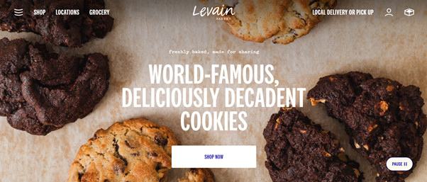
Bakery websites must make you crave their products. Levain is one of the most famous cookie stores in New York.
Its website is simple, clean but makes us want to try every cookie on its menu. Levain can fit in their online store and all the information about their selling points without confusing the visitors.
A while ago, they had an online live camera that broadcasted the cookie counter on some of their stores: talk about cravings.
There’s nothing more tempting than a freshly baked and warm chocolate chip cookie. Even though we cannot smell this one, the video animation that this website shows on its landing page is captivating. We become pretty sure we want this cookie.
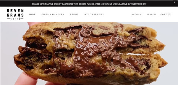
Seven Grams has a single-page website, a fairly common strategy for bakeries and restaurant websites because it simplifies navigation. Users explore only by scrolling down or on the main menu that has all the relevant sections.
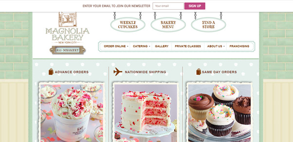
Magnolia Bakery’s website reminded us of the early websites when backgrounds were textured, and graphics had 3D effects. But it works perfectly for this bakery’s identity: sweet and friendly.
Besides, this “vintage” design has an authentic touch, proving that creativity is not duly minimalist and hip.
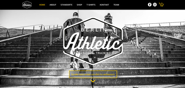
Berlin Athletic has a single-page website: the landing page has a photo that captures our sight, and in the center, we find the logo and a CTA button for booking classes (in yellow to contrast the black and white background).
One of the most appealing traits of this site is that they include an online store for class passes, which can be very useful for busy gym-goers.
Otto Haus designed an elementary and straightforward site, but their front page is stunning: the shot from below cars is attractive and beautiful. Then, as you scroll down, they explain their area of expertise: German luxury cars.
Then, they showcase their work hours, locations, contact numbers, and a little context on why they love their job.
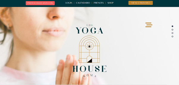
This yoga center has an excellent website that can explain its multiple services: classes, courses, and retreats. They divided each section into different tabs within the website.
We can also highlight all the background pictures in all the sections: they have a sound color palette and powerful shots that play gracefully with the brand’s identity.
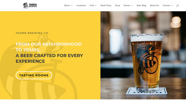
This site’s primary strategy is to invite users to go to any of their locations. That’s why we find a quick button on the main page that leads to a list of sites of their breweries.
All the website chooses to use white backgrounds that help us to keep our eyes on the content: locations, history, informative videos about beer and its processes, pictures and Newsletter subscription.
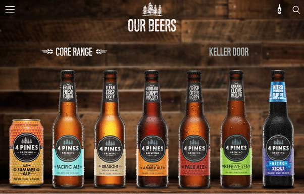
4 Pines is a family-owned and artisanal brewery that perfectly integrates its corporate philosophy with its image. Since its beginnings, the brand has had a program called “Save the Pines,” which promotes environmental responsibility in all business processes.
The rustic image, the pine graphics on the site and the products, even the logo: they integrated to encourage environmental care.
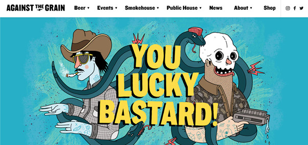
This website is an extraordinary experience: they use a colorful and fun group of graphics that makes it very pleasurable to visit. Against the Grain can create its identity as a brewery, restaurant, and event room, through a website that’s creative and alluring.
The ultimate intention behind this website may be to prove that beer culture is just pure fun. All the types of beer they offer have particular names, and art pieces are all over the pages and sections, making it a very nice site to navigate.