Best Restaurant Websites Every Owner Need to Visit
Restaurant businesses are very prolific in terms of design possibilities for their websites, especially during the last year, in which online presence has shown to be more crucial than ever.
Food is one of those products and services that are easily exposed in stunning photographs. With some simple elements, anyone can build a professional website that allures new and existing customers.
This one has been a trend possibly since 2016, but it seems to be one of those classic choices that still is undefeated for design and functionality purposes.
Maybe you have noticed a type of menu in both mobile and desktop websites that consists of three lines (stacked in a way similar to a burger).
This design “cleans up” your website navigation, although some people may not know what it means, especially if it doesn’t include the word “menu” (which is often the case).
The hamburger menu was born as a way to condense menus while still making them visible.
Trend #2: The cinemagraph
A cinemagraph is just a “live” photo. It’s a photograph in which a minor and repeated movement occurs in a video clip on a loop. Designers often create these pieces in GIF format, and they offer the illusion that the photo is moving.
Some examples you may have seen on some websites are:
A glass of beer with moving bubbles.
Some fruits with water dripping on them.
A broiled chicken with moving flames.
Trend #3: Amazing photography
It’s no secret that photos sell your restaurant, so they deserve a professional approach. You may want to hire an expert for this chore, and it will pay off.
This trend may not be a new one, but the last pandemic year has shown more than ever the importance of visuals to customers when choosing to dine out or order delivery.
Related to the importance of photography, we can also point out the growing use of “hero images”: large banner images usually placed front and center on restaurant websites. They are what your visitors see first when they arrive.
Trend #4: Fonts
Fonts can have the same attractive effect as photographs if you use them correctly. The goal here is to apply fonts in combination with photos to express the restaurant’s identity.
You may experiment with different font styles but stick to your brand image and harmony within the website.
Regarding fonts, don’t forget less text and more photos is the rule in restaurant websites. But text cannot be overlooked: remember, search engines need text to index your site accordingly: you may want to include some text with each image.
Trend #5: Parallax scrolling
Scrolling effects are one the most significant trends in websites due to the massive influence of mobile navigation. It simulates the way we scroll down on our mobile devices to explore social media and websites.
One-page restaurant websites are widespread nowadays. And one easy way to do this is to use parallax scrolling: a visual effect in which users scroll through the background moves
1. Yang’s Place
Yang’s Place is a family-owned Chinese restaurant in Australia. Their website stands out at first sight because of the geometrical front page, full of color, some text, and beautiful food pictures.
This website delivers a great job at telling users who they are and what they do. There’s an “About Us” tab in which we find graphics and short text chunks describing the restaurant. This format makes it very easy to read this information.
2. Schaller’s Stube Sausage Bar
This restaurant is a crossover between Berlin’s street food and New York food style. The website is a single-page site, which can be very time-saving as all the information is available if you scroll down a little bit. It’s a straightforward yet effective strategy for websites.
Schaller’s Stube chose to include many colorful pictures, history, news articles, Google Maps location, address and, contact data. All of these are the basics for restaurant websites.
3. Maialino
This restaurant’s website is all about the pictures. The front page is composed of a horizontal gallery with colorful, cozy, and tempting photographs. But the essential trait of this choice is that this gallery can reflect the brand’s identity: classic but relaxed.
There’s a very creative detail on this site: they included an anchored menu on the bottom in which we can find the restaurant’s location, telephone number, and tab to buy gift cards.
4. La Barraca
This tapas restaurant uses striking visuals on its website: photographs can make you feel in the place, drinking with friends and almost tasting the food.
As we said before, photos are especially crucial in restaurant websites, not just for illustration purposes, but to achieve a sense of the experience visitors may live if they go and try your business.
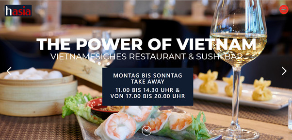
5. Hasia
Besides the fantastic photographs, this restaurant is a champion in organizing its contents. They use centered blocks to break up the layout, which makes a friendly and easy-to-follow website.
This website does a fine job balancing text and images. One-page websites like this are effortless to navigate because you just scroll down and look at everything without making any additional clicks.
6. Restaurant Bonaparte
This traditional French restaurant chose a conventional website design: a menu with different sections including location, menu, specialties, chef’s biography, and a beautiful history about this legendary place in France.
They know their identity resides in the tradition, so that a one-page website may be too modern. But they use a hamburger menu to organize all the sections, which are well balanced between photos, drawings, and text.
7. Kyu Restaurants
Kyu chose to place a horizontal gallery on the main page with stunning photographs that capture your attention. As you scroll down, you find both locations in Miami and Mexico. And a quote by Banksy that resonates with their vibes.
They used a mixed format between a one-page website and a traditional menu. On the top part, there’s the rest of the menu with secondary sections like history, social labor, related art, and local partners.