When you think about brewery websites you may not think of functional designs, easy navigation, or beautiful graphics. And this is assuming they even have a website at all. But times are changing: breweries do need websites because more and more people are now reaching to Google for new places to try.
Plus, the pandemic has shown that every business needs to have a solid digital presence to succeed.
This doesn’t mean that a craft brewery needs to have a good website (or one at all). Websites cost money and take time to create and update, while social media can be your chosen platform to post info about your business for no money and little time.
But, websites may be a considerable differentiator: a good website with beautiful aesthetics and beer labels don’t necessarily mean a brewery has good beer. But it does suggest your business is serious about your product and location.
If you are convinced your brewery may do good with a website, take this checklist with you when building it:
Relevant info must be front and center.
Properly-sized photos.
Easily navigable
Responsive mobile site.
Service hours.
Contact info
Locations.
These are the basics for a good website, but you will need to work hard on sound design, clean graphics, and simplicity if you want an excellent brewery website.
Now, let’s take a look at some inspiring brewery websites.
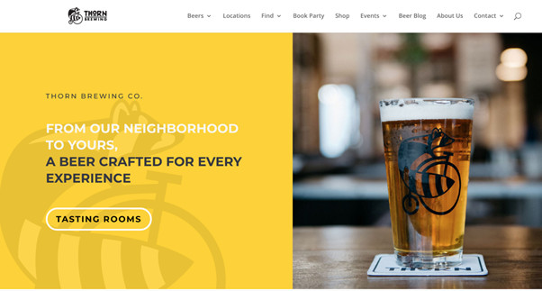
This site’s primary strategy is to invite users to go to any of their locations. That’s why we find a quick button on the main page that leads to a list of sites of their breweries.
All the website chooses to use white backgrounds that help us to keep our eyes on the content: locations, history, informative videos about beer and its processes, pictures and Newsletter subscription.
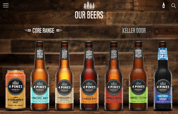
4 Pines is a family-owned and artisanal brewery that perfectly integrates its corporate philosophy with its image. Since its beginnings, the brand has had a program called “Save the Pines,” promoting environmental responsibility in all business processes.
The rustic image, the pine graphics on the site and the products, even the logo: they integrated to encourage environmental care.
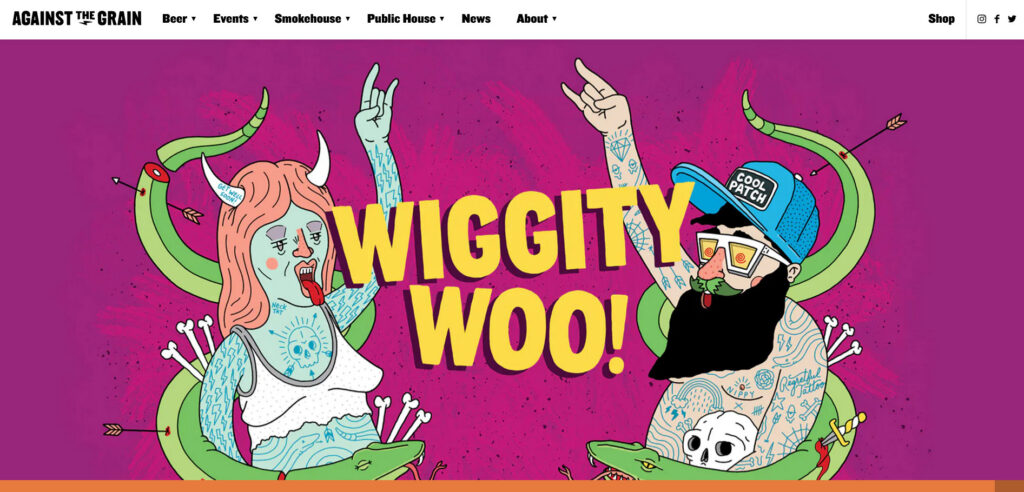
This website is an extraordinary experience: they use a colorful and fun group of graphics that makes it very pleasurable to visit. Against the Grain can create its identity as a brewery, restaurant, and event room, through a website that’s creative and alluring.
The ultimate intention behind this website may be to prove that beer culture is just pure fun. All the types of beer they offer have particular names, and art pieces are all over the pages and sections, making it a very nice site to navigate.
Archetype’s website is intuitive and professional but shows its personality and creativity in all its designs.
They have a remarkable detail in the “About our beer” page: a short personality quiz to assign you an “archetype” and match you with a beer. These small ingredients demonstrate that the business serves its customers and offers a unique place to drink.
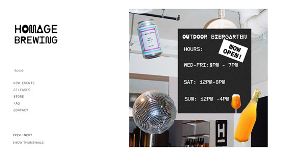
5. Homage Brewing
Homage has an authentic simplistic design, which can be tricky because ultra minimalism has to be done right. Designers know it’s not enough to write something over a white background. This brewery is an excellent example of great simplistic design: they are passionate about aesthetics and fonts, not only on the website but also on their products.
Besides, photography can be a valuable part of a minimalistic design, don’t be afraid of using them.
Pang Pang knows their product is good enough on its own; that’s why this website is all about colors and graphics, and unique photographs. Art is their guide, and the site shows it. They are resourceful in balancing text and graphics.
All of the important details are easy to find, and one can surely remember their beer cans because they are gorgeous.
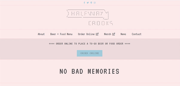
This brewery is all about retro-tech nostalgia inspiration, although it is a little far from brewery designs. But the key here is to do it well, and well, they did it. Halfway Crooks present details like the .txt file font, esoteric descriptions, and lots of humor.
You may notice on this website the lack of photography, at least on the main page. This is a considerable risk you may take if it is in service of a concept, in this case, the retro website vibes, in which photos were not part of websites because they took forever to load.
This website placed a cinematograph piece on their main page: it’s an animated logo that simulates a beer texture. This type of video can be too heavy on mobile versions, so they replaced the animation with a steady image on their mobile version.
They use a scroll-down design in which we discover some of their signature beer flavors; as you scroll, elements seem to be moving, which is a pleasant effect. Plus, check the beer can designs; they are remarkable and unique.
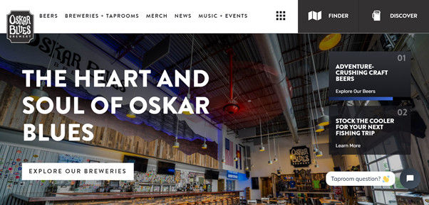
This site has a clear identity, color schemes, and great photography. The website includes a store finder bottom on the main page and a chat section for questions about the brewery as they have multiple locations.
This is an excellent example of a brand that knows how to integrate a lot of information about its business (locations, products, news and events, online merch store, chat, and map) without saturating its visitors.