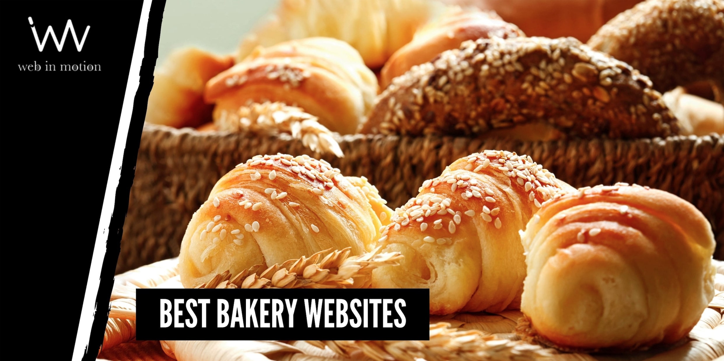
It’s a fact that food appearance has a great link with the level of appetite. And, usually, bread, rolls, cookies, pastries, cakes, muffins, pies, and dessert are visually appealing products.
This represents a massive advantage for bakery owners interested in building a new website or redesigning an existing one. They have a clear starting point: provocatively showcase your product.
Most small bakeries are traditionally local businesses with local customers. Still, nowadays, online presence is a critical way to expand and support brands that may be falling behind due to the pandemic. Besides, websites and social media activity may be a differentiator factor from the competition.
If you need some inspiration for your bakery websites, here are some great websites that showcase different styles and identities but accomplish the same goal: make you want to try everything right away!
As you explore through these websites, notice some elements that can guide your decision towards your bakery website:
Landing page gallery or video animation.
One-page scroll down page or hybrid.
Photographs, photographs, photographs.
Important info is always visible and easy to find.
Website design matches brand identity.
Now, take a look at these well-done bakery websites for some inspiration. Just don’t visit them while hungry; cravings may appear instantly!
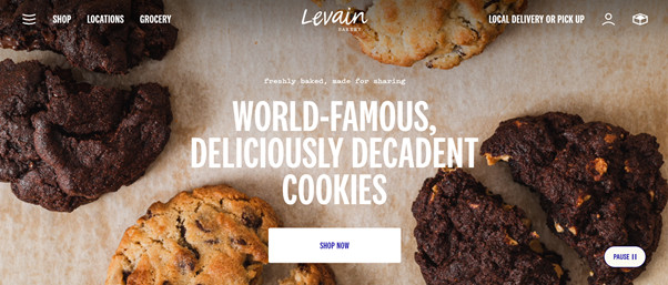
Bakery websites must make you crave their products. Levain is one of the most famous cookie stores in New York.
Its website is simple, clean but makes us want to try every cookie on its menu. Levain can fit in their online store and all the information about their selling points without confusing the visitors.
A while ago, they had an online live camera that broadcasted the cookie counter on some of their stores: talk about cravings.
There’s nothing more tempting than a freshly baked and warm chocolate chip cookie. Even though we cannot smell this one, the video animation that this website shows on its landing page is captivating. We become pretty sure we want this cookie.
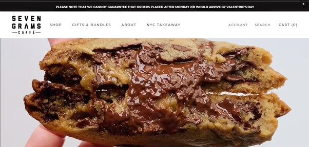
Seven Grams has a single-page website, a fairly common strategy for bakeries and restaurant websites because it simplifies navigation. Users explore only by scrolling down or on the main menu that has all the relevant sections.
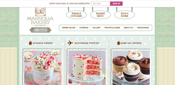
Magnolia Bakery’s website reminded us of the early websites when backgrounds were textured, and graphics had 3D effects. But it works perfectly for this bakery’s identity: sweet and friendly.
Besides, this “vintage” design has an authentic touch, proving that creativity is not duly minimalist and hip.
Bakery websites are vast users of hero images. For a good reason: appetizing food photographs encourage visitors to stay and watch a bit more, or in this case, scroll down, as this is another one-page website (lookout for this trend, which is here to stay).
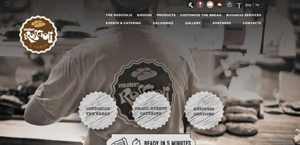
Italian bakeries don’t need much presentation; it’s part of their identity, being classy and classic and nostalgic about the vintage way of living. This website captures this purpose perfectly in their design, black and white photograph, pizza, bread, and some info about their bakers.
But technical functionalities are not vintage: their one-page scrolling page works just fine, and the mobile version is optimal.
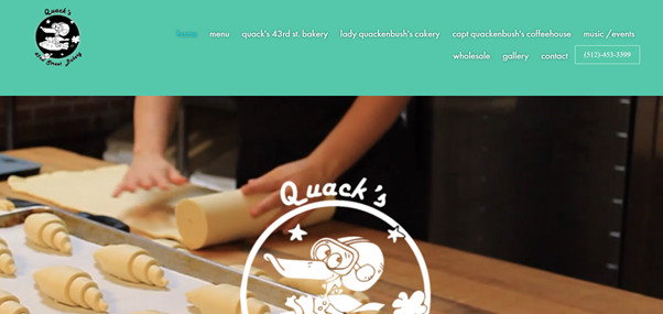
Quack’s has a landing page that makes you stick in it for a while. The main gallery of videos is alluring and satisfying to watch: a cupcake being decorated, some croissants rolled, and a freshly brewed latte.
This is a hybrid-style website because it has a scroll-down design in which we can find important info, like address, contact data, location, and update on services around covid-19. On the top screen, we see the main menu with the rest of the sections: menu, gallery, locations, events, and contact info.
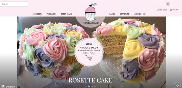
This bakery has a traditional aesthetics that matches its identity and purpose but remains clean and simple. The main page has excellent photographs with beautiful cakes and decorations with a fixed bottom that leads to the online shop page.
If you scroll down, you may find other sections like a catalog and baking classes. And then, on the top screen, you can choose other options on the main menu. This proves hybrid designs also work fine for bakeries and restaurants. Keep in mind important info and images need to be on the main pages.
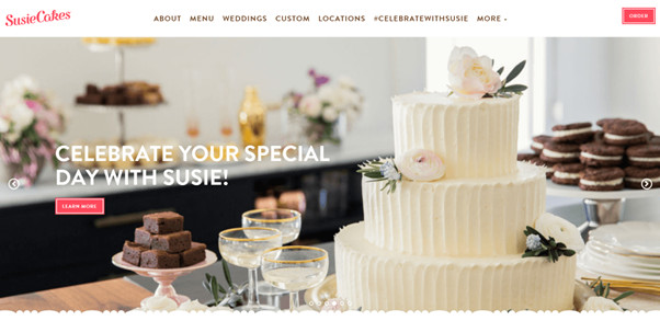
Susie Cakes does an excellent job of expressing its brand with a minimalistic, classy, and colorful style. The brand colors are used gracefully throughout the website and menu to make the whole website attractive and cozy.
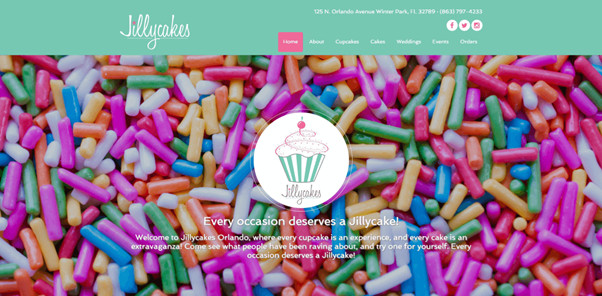
This website is excellent at leaving a lasting first impression. When you land on the main page, there’s a colorful sprinkles background with a logo, but the truly remarkable part comes when you scroll down. They use a parallax effect: you see other things appearing, but the same background sticks on your way down. Jillycakes is resourceful when showing up its bakery creations: instead of making up a gallery for the website, they embed their Instagram page.