Best Professional Services Business Websites (2021)
Did you know that users looking for a service online usually visit two to three websites before making a phone call or booking an appointment?
If you have a business-related business, your website must sell your services effectively and quickly prove why your business deserves that phone call.
It’s common to wonder if business-related websites must be different from product-based ones.
Marketing principles and traffic generation techniques are similar for both cases, but the business that sells services face unique challenges, like:
- You are the product: When you are selling services, you are the product. It doesn’t matter if you are a real estate agent, a doctor, a lawyer, a hotel, an auto repair service, a chef, or an interior designer. You’re selling your time and the promise of a particular result.
- Your time is limited: Unlike businesses that sell products that can be stored and shipped on demand, your service-related business can only sell what your time allows.
- Deliver and customize: You must prove you’re able to deliver the results you promise, but you must also show customers you are flexible to their own particular needs and requests.
- Your website is a global medium but needs mostly local customers: Service-based businesses depend almost exclusively on local customers (although pandemic dynamics have changed this: several services now are offered digitally, like some healthcare services).
Don’t be afraid; these challenges are a natural process of service-related business (and product businesses have their challenges). You just have to have specific strategies well defined when creating your website. These are just a few of them:
- Strategy #1: Establish your credibility. When you’re selling services, you’re usually selling a relationship between clients and yourself.
You can establish that credibility by including a list of credentials on your website. It’s not just about a list of awards or recognitions but also explaining how those credentials will translate into benefits for your clients.
- Strategy #2: Be very specific about what you’re offering. You cannot take for granted that users already know your business or what you do precisely. A good practice is writing a list of services that includes everything your company can do.
- Strategy #3: Always make contact between your business and customers as easy as possible. It may seem obvious, but many websites fail in helping users find contact info or communication tools like chatbots or email widgets.
These are only some simple and generic recommendations, but they’re also crucial when creating a website for your service-related business.
Building a website may be easy nowadays, thanks to all tools available at hand, like Wix or Squarespace. But there are some minimal requirements that you can verify with this practical and essential checklist:
- Choose your layout, whether it's a classic website or a single-page one.
- Prepare all your branding beforehand: logos, graphics, color scheme, etc.
- Add just the right amount of page, , tabs, or sections to your website.
- Always include a scheduling service or booking system to sell your services.
- Pay enough attention to SEO on your website with things like domain name, titles, contents, images, etc.
- Your website must be mobile-friendly.
- Ask for a second opinion.
- Regularly update your website with new content, graphics, new look, etc.
And now, for some inspiration, here are some of the best business-related services websites, from consulting offices to auto repair shops.
Best legal consulting websites
1. “Harris Ingram LLP” Demo
Creating a legal consulting website is no easy task. Creativity is undoubtedly limited to the business’s gravity, and designers must use pictures or graphics with caution. Too many photos or images can seem annoying or out of place.
For this example, Squarespace has this website demo with geometrical figures and elegant colors that may not need any graphics or pictures at all. On the first page, we can read the firm’s specialty, and we find the main menu right to explore all the services offered, the business’s history, success cases, and contact info.

2. Shumway Van
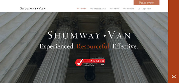
This firm has a very organized and straightforward site where you can find absolutely everything you need to know about this organization. The site has defined sections within a single page, and thanks to appealing images, our eyes remain glued to the screen during the visit.
The design and pictures offer an adequate balance between seriousness and coziness. We can also point out that they chose fonts with and without serifs for the titles and contents: this is a very modern and fashionable strategy.
Law firm websites are often very focused on their branding and are very agile to express their identity on their front pages. Bend Law Group is a perfect example of these practices. They have a main page that catches us immediately and an alluring title that describes their philosophy: “Dream big. We got your back”.
The site’s main page also includes famous publications that had mentioned the firm (The Washington Post, Business Insider, Forbes). Then they describe their area of expertise: small businesses and startups.

Best therapy websites
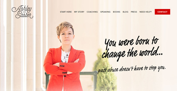
Ashley Easter is an activist, coach, and abuse survivor advocate. Her work is all about empowering all types of abuse survivors to change the world and go after their dreams.
The picture chosen for the main page expresses her goals very clearly: power and growth. This website inspires confidence and clarity towards what Ashley does at her practice and activism. That must be the goal for all therapy businesses.
2. “Allan Johnson” Demo
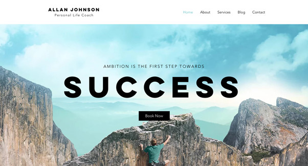
This demo website has a compelling image that can stick in our minds even after our visit. When you arrive at this website, you already know its purpose: acquire Success.
A simple bottom below the main title allows you to book an appointment. But before that, you may explore and read a brief biography for the therapist, fees, and contact information.
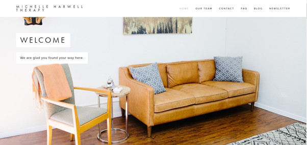
Doctor Harwell founded her first practice in 2011, and she has grown thanks to a team of therapists (all women) under her leadership. Her brand offers various services, including group therapies or single sessions.
This website welcomes us with a picture that makes us feel comfortable, cozy, and within trusted walls: perfect for those looking for mental health-related help. Each section has colorful photographs and concise información in a Q&A format.
A portal inside the website is used for patients to manage appointments, payments, and some reminders for customers.
Best musicians websites
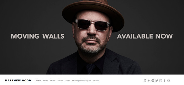
This Canadian folk-rock musician is an excellent example of a website that can express the artist’s identity.
Pictures do not overdo it: there’s only one big photograph on the main page with an announcement for his new album. They also chose to place the main menu at the bottom, which may be trendy if well used.
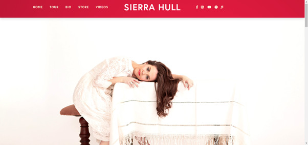
Like the previous website, this can capture the artist’s personality and aesthetic ideals, even before listening to her music. The photo on the cover page, color selection, simplicity, and details: are elements that help us understand the artist.
This website is straightforward, but it gathers together everything we need to know: information about her new album (download and streaming links), a list for upcoming tours, an online merch store, biography, and links to her social media posts.
3. Andrew Huang
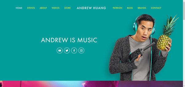
Andrew Huang is a musician and YouTube celebrity, and therefore he needs to have a relatively active online presence with frequent interactions.
His website expresses his trendy and fun style, but it is also a “hub” in which we can find all kinds of content. For example, it has a tab for blog content with articles like composing music at home.
Best auto repair websites
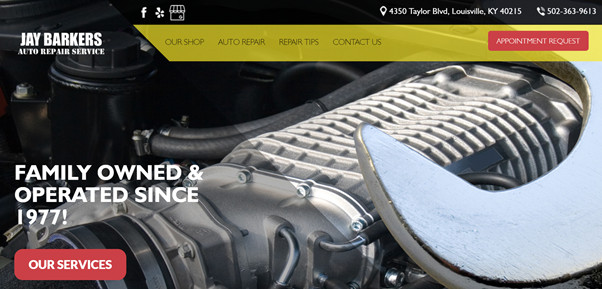
Jay Barkers has a clean and beautiful website that shows the essential info right from the start.
For auto repair businesses, all the information about services offered and service schedules must be easy to search. This site does it very well, except that the city is not visible on the landing page.
This website has a section with informative articles about auto repair at home or tips to save money on reparations.
Otto Haus designed an elementary and straightforward site, but their front page is stunning: the shot from below cars is attractive and beautiful. Then, as you scroll down, they explain their area of expertise: German luxury cars.
Then, they showcase their work hours, locations, contact numbers, and a little context on why they love their job.
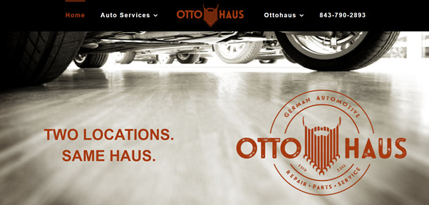
Without hesitating, this is one of the most outstanding auto repair websites we found. All its images, the logo, the colors, and design have a “retro” touch that’s nice, mainly because they do it gracefully through the website.
They wrote the shop’s location right up front on the landing page, a simple yet valuable strategy. It may seem irrelevant, but sometimes the city and area are not so visible, which can be time-consuming.
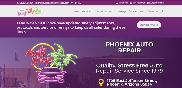
Best dental practice websites
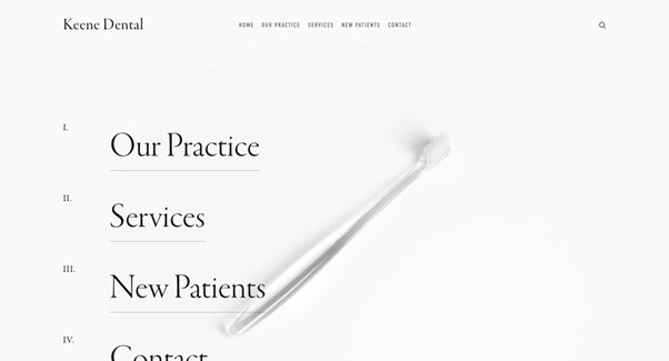
1. “Keene Dental” Demo
This Squarespace demo works perfectly for most dental businesses. It offers a clean and professional design with a visible and easy menu and delivers a traditional color scheme fit for a dental care facility.
The section division is quite convenient because we easily find all the relevant information: staff description, services offered, locations, etc.
In a city like New York, with more than 2.600 registered dentists, it’s a difficult place to choose a dental business that stands out online even though this website does an excellent job thanks to the focus inverted to the experience of attending their facilities.
This website is a true reflection of this experience, with details like the joyful intro video on the landing page, in which we get an idea of how we might feel when we visit one of their locations.
Overall, Tend chose a minimalist style for its website (a common choice for medical practices). It has clean sections, an easy-to-read design, and colorful and welcoming pictures
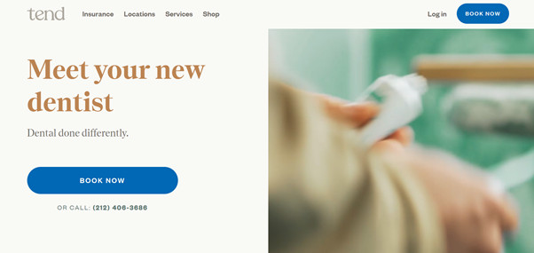
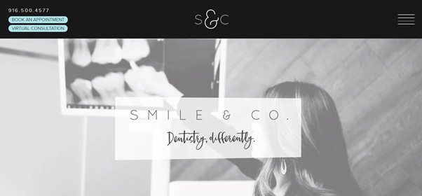
This dental practice is an excellent example of an adequate balance between quality content and design. The look is fun, friendly, creative, and it offers welcoming feelings: it’s a suitable choice for young practice.
Even if they didn’t place a CTA button to book visits easily, we find the contact number right upfront with the landing’s page title.
We can notice that this website’s pictures are original, not stock: plenty of personality and authenticity.
